The Kick Map |
||||||||||
 | ||||||||||
|
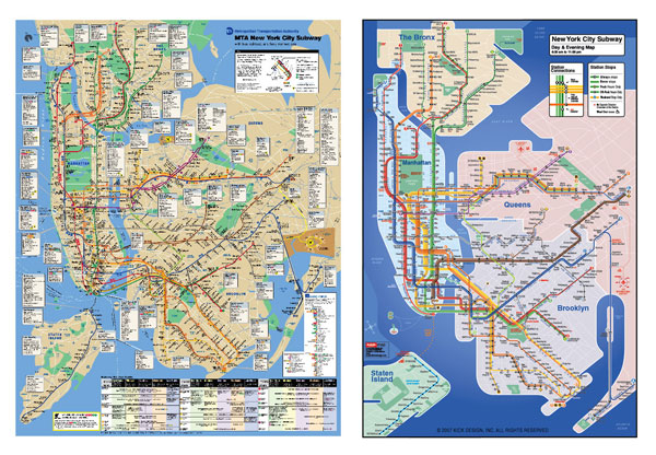
The Kick Map is designed to get more people to ride New York City's subway system. Created with clarity and ease of use, it allows riders to navigate this vast system easily and without uncertainty.
The subway map is the key to understanding this most complex subway in the world, which has 26 separate lines and 468 stations. A well-designed map not only welcomes and empowers novices to use the subway but also encourages additional use for regular "home-to-work-only" commuters to use the subway for recreational destinations where they might otherwise take a car. For this reason the design of the subway map can directly influence ridership numbers and can indirectly have an effect on New York's traffic congestion and pollution.
In short, a better-designed subway map will make our subway system more open and accessible.
The unique complexity of New York's subway system To understand the challenge of visually communicating New York's subway one must understand New York's unique geography and its street system, both of which have an impact on the mapping. There are four significant and conflicting aspects that make the New York City subway impossible to successfully map with just a diagrammatic or just a topographic format. They are:
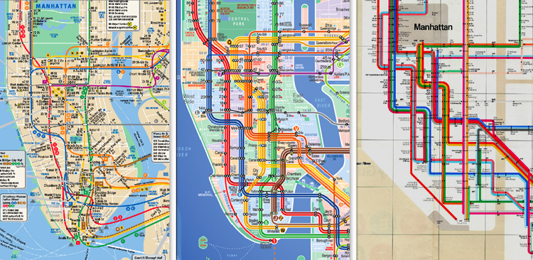
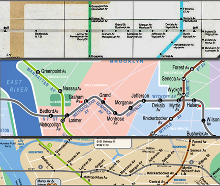
Because New York City's subway generally follows its gridded street routes, there is a strong psychological link between the subway and the aboveground topography that is not found in a city like London. Any location - take 42nd Street and 7th Avenue as an example - places you in the grid, which makes it easy to judge distance and location. This is why the numerous geographical errors that can be found in a NYC subway diagram map (like Massimo Vignelli's 1972 MTA map infamously placing the 50th Street and Broadway stop west of 8th Avenue instead of east) are quickly spotted and glaringly "wrong." [By contrast, London is a circular city bisected by a single river with a subway system (the Underground) that fans out evenly from the city center. With its chaos of randomly intersecting and proper named (versus numbered) streets and its tube system that doesn't follow them, a pure diagrammatic (Beck) map with geographic inaccuracies is not only tolerated, but its abstract simplicity is actually welcomed.]  [A comparison from left to right of the current MTA map, the Kick Map, and Vignelli's map] The Kick Hybrid Map concept The Kick Map is a "hybrid" concept that resolves the 50-year debate between the exclusive use of either a diagrammatic or topographic mapping of the New York City Subway. Both map types have inherent strengths and weaknesses in their attempts to translate the maze of this complex system. Used alone, each makes the subway system very hard to understand for a surprising number of people. The Kick Map's hybrid concept doesn't allow the strict dogma of either type to get in the way of the map's primary function: to display the whole system and its relation to the city as clearly as possible. It is designed with a combination of both diagrammatic and topographic features, thus enhancing the strengths and eliminating most of the weaknesses of both types. One premise of the Kick "hybrid" map is that while most of the time a straight line is the easiest line to understand, there are important exceptions.  The L Line comparison (from the top): the Vignelli Map, the Kick Map, the current MTA Map. When the Kick Hybrid Map acts like a topographic map The Kick Map employs "route bends" in a subway line's route to signal to the user important aboveground road changes. For example, when the #6 train "jumps" across from Park Avenue to Lexington Avenue as it travels north, this is shown as a bend on the Kick Map as it would be in a topographic map. Instead of having to read words to know when this "jump" occurs (as in the Vignelli map) the "route bend" itself communicates the change quicker and more accurately. Similarly in the Bronx, when the #4 train jumps from River Avenue to Jerome, this is clearly and simply shown. And the same holds true for the L line in Brooklyn as it travels along the major thoroughfares of Metropolitan Avenue to Bushwick Avenue and on to Harrison Street. Unlike the Vignelli map - where the positions of the stations and lines are distorted for pure graphic harmony - the Kick Map, while stylized for clarity, has stations that are "location accurate" i.e. all the stations are in the correct position in relation to each other and to the topography above. The Kick Map also presents a comprehensive grid of major streets and avenues that intersect with all the station stops to help orient the rider to the stop and the streets above. The Vignelli map has none. In short, the Kick Map empowers the map user to better understand the relation of a subway stop to the geography above it. When the Kick Hybrid Map acts like a diagrammatic map The hybrid concept irons out the "kinks" of any single street as it would in a diagram map. Unlike the current MTA map, a single road's "wiggles" are straightened out as, for example, with Queens Blvd or the Grand Concourse. And for clarity the Kick Map keeps to standardized angles whenever possible. The diagrammatic form allows for visual simplicity and a significant reduction in size as the biggest form of the Kick Map is only about two-thirds the size of the current one. The smallest versions still have complete transfer information and when folded can easily fit into a wallet. Additional Features of the Kick Map While there are separate lines for each of the trains, they remain true to the existing MTA signage colors - for example the 1, 2, & 3 lines are all red; the A, C, & E lines all blue, and so on. Each station shows at a glance what train stops there and whether the train stops there all the time, stops only at peak hours, or stops only at off-peak hours. Each station shows the reader whether they have the ability to cross over to go in the opposite direction for free. This is an important feature for there are 87 stations - 56 in Manhattan alone - that do not allow free access to cross over. With all the non-subway information that the current MTA map does show - like the location of all the heliports in the city - it doesn't offer this simple but important piece of subway information indicating what station stop to get off to turn around in case you miss your stop. Relevant station stops show wheelchair access and connections to commuter rail lines (PATH, Metro North, LIRR). Bus information is shown for highly trafficked destinations that are not served directly by the subway (the Javits Center, Riis Park, Orchard Beach, and LaGuardia Airport) to further discourage automobile use. The Air Train connections to Kennedy Airport are also shown. In summary, the user-friendly Kick Map has been designed to encourage subway ridership, for both New Yorkers and visitors, and thereby to reduce automobile traffic, congestion, and pollution - not to mention confusion - in our great city. | ||||||||||
|
BACK |
© 2019 KICKMap LLC | |||||||||